Color selection for botanical garden playground equipment is a design decision with operational consequences. When a family play area sits inside a carefully curated garden, bright primary colors can interrupt sightlines and make the space feel more commercial than contemplative. Muted greens, warm browns, charcoal greys, and pale botanical blues let play structures recede among plantings while still keeping clear circulation and age-appropriate boundaries. In my work on unpowered playground systems, I see many gardens overcorrect by choosing institutional beige or oversaturating with cartoon color. The better answer is a restrained finish plan tied to the garden’s existing palette, with selective high-contrast accents only where safety requires them.
Botanical Garden Playground Colors Start With the Garden View
Most color mistakes happen before the first finish swatch is approved. A botanical garden carries carefully composed views, and a children’s area is only one layer in that composition. I ask garden managers to list two or three sightlines they want to protect before we place equipment. The equipment should read as part of the middle-ground vegetation, not as a foreground sculpture. That usually means avoiding saturated reds, vivid yellows, and pure white structures unless the garden already uses those tones in built elements.
Color hierarchy matters more than camouflage. A dark graphite frame with sage panels can recede against shaded foliage, but a fully green slide hidden among shrubs creates its own safety and supervision problem. We are not trying to make children disappear; we are trying to keep the play area from winning every view by default. A useful rule is to pull the large structural masses back with muted colors and reserve stronger accents for handholds, sight lines, and activity zones.
Why Does Full Camouflage Fail in Garden Family Areas?
Full camouflage fails because families need to find entrances, exits, and boundaries quickly. A slide that disappears into a hedge may be visually quiet, but it also hides the point where children step into the fall zone. Garden supervisors also need to scan the area quickly during crowded afternoons. The best solution is visual recession for large structure surfaces, not invisibility. Keep the major volumes muted and leave clear sight lines to each entry and exit, with a small amount of tonal contrast on the leading edges.
Muted Color Palettes Keep Equipment Low Against Planting Beds
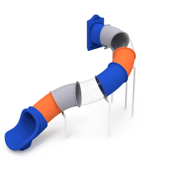
Restraint does not mean one shade of green. The most successful botanical garden play areas we have designed use a narrow palette of three or four finishes repeated across every structure. Sage green, bark brown, warm grey, and soft bronze sit comfortably beside plantings without making the playground feel industrial. Repeating the same finish family across a slide, a spinner, and a spring rider creates a unified rhythm that reads as garden furniture rather than an amusement zone.
| Finish direction | Effect in a garden | Good pairing | Caution |
|---|---|---|---|
| Deep green | Recedes into broadleaf planting | Bluestone or timber edging | Can feel too uniform in full shade |
| Bark or umber brown | Grounds equipment visually | Gravel paths, timber benches | Shows leaf litter less but can fade in strong sun |
| Warm grey | Bridges stone and metalwork | Granite edges, steel trellises | May read cool against evergreen walls |
| Pale botanical blue | Keeps a light visual touch | Water features, lavender beds | Avoid on large roofs if glare is a concern |
| Charcoal or graphite | Frames moving parts cleanly | Modern garden architecture | Use for accents, not large surfaces |
One caution: shade changes color more than most planning documents suggest. A deep green that looks correct on a sample table can turn almost black under dense canopy. I ask teams to photograph finish samples in the actual planting area at mid-morning and late afternoon before locking the palette.
Material Selection Changes How Botanical Garden Colors Age
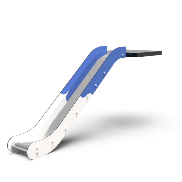
Color stability in a garden is not only about the topcoat. Galvanized steel, powder-coated steel, rotationally molded LLDPE, and stainless hardware have different heat, moisture, and chalking behavior. In a planting-heavy environment with irrigation, morning dew, and low air circulation, the plastic components should carry UV stabilization in the resin, not only in a surface treatment. That is the difference between a sage panel that holds its tone for several seasons and one that turns chalky after two summers.
Powder-coated steel gives us the widest range of controlled colors for frames and posts, and it protects the metal below. We specify polyester-based powder coatings for garden sites because they resist color shift from moisture and plant acids better than some general industrial paints. Stainless steel hardware matters at connection points, but it should be selected for corrosion resistance rather than for its silver brightness. A brushed or bead-blasted stainless surface creates less visual interruption than a mirror-polished bracket.
Material decisions affect both durability and the way the finished color holds up under plant cover. <Playground Slide Materials LLDPE vs 304 Steel Performance> covers how LLDPE and 304 stainless compare for outdoor exposure, which matters when a garden wants muted finishes that do not chalk, stain, or corrode in humid planting areas.
If your garden includes shade-sensitive planting beds or low clearance around existing trees, color selection should be confirmed alongside equipment footprint and installation clearances. Send your site plan and current palette reference to [email protected] or WhatsApp +86 13915684545 before finalizing the finish schedule.
Botanical Garden Play Areas Still Need Clear Safety Accents
Color restraint cannot extend into every detail. Children and supervising adults need to read the difference between a stable landing surface, an entry step, and a moving element at a glance. In our design process, we reserve high-contrast accents for hand grips, slide entry edges, seat contours, and the boundary between fall surfacing and planting. A muted green climber with a warm yellow handhold is easier to supervise than a fully green structure with no visual cues.
Safety accents work best when they follow a repeated logic. We use one accent tone across all vertical grip points, another for moving parts, and a neutral tone for large panels. That way a returning family quickly learns the color language of the play area. The garden still reads as calm because the accent colors cover only a small percentage of the total visible surface.
How Much Contrast Does a Garden Play Area Need?
Contrast does not need to be loud, but it must be consistent. The visual difference between a handrail and the panel behind it matters more than the absolute color. We aim for a clear tone gap at grip points and moving parts while keeping the main structure in the garden palette. This gives supervisors a fast read and keeps the area connected to the planting context.
Specifying Playground Finishes for a Botanical Garden Family Area
Specifying colors early prevents expensive changes later. I have seen projects delay because the garden committee approved a concept render, then rejected the actual powder-coated components when the shade read too warm. A better process is to request finish samples before production, send reference photos of the planting beds, and confirm whether the manufacturer can match a RAL or Pantone reference for metal and plastic parts.
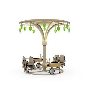
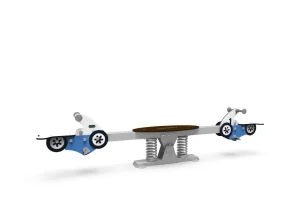
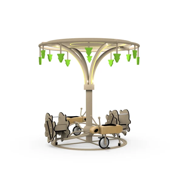
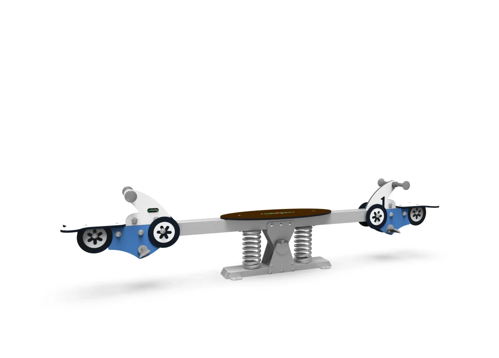
At Suzhou LvDong Amusement Equipment, we set color approval as a production gate. A multi-player spinning wheel in a 120 to 200 cm diameter range reads very differently in garden grey than in bright orange, even though the structure is the same, and the same logic applies to spring riders and seesaws.
Every botanical garden project benefits from a finish schedule that names the structural color, the accent color, the surface treatment, and any anti-graffiti or anti-chalk coating. That schedule should travel with the purchase order and the installation packet so the site team can verify that delivered parts match the approved sample.
Botanical garden sites often sit on planted slopes or near irrigation lines, so groundwork decisions affect how clean the finished installation looks. <Playset Ground Leveling and Drainage Solutions for Outdoor Slides> covers drainage and leveling choices that keep play surfacing stable and reduce staining around low-profile equipment.
For a botanical garden family area, the best next step is not to guess from small digital screens. Send photos of the planting beds, the nearest hardscape, and the proposed play area boundary to [email protected] or WhatsApp +86 13915684545. We can prepare a finish board and equipment layout options from those references. If the garden is still in early design, share the approximate footprint and we will confirm which products in the unpowered range can be matched to the palette without delaying the schedule.
Common Questions About Botanical Garden Playground Equipment Colors
Do muted playground colors reduce child engagement?
No, muted base colors do not reduce engagement when play value and movement are strong. Children respond more to climbing sequences, spinning motion, and social roles than to whether the frame is bright orange or sage. A calm background can even sharpen attention on the equipment itself, especially when high-contrast accents mark handholds and entries. What reduces engagement is a bland, single-color structure with no variation between zones. We keep interest by varying material texture and using one warm accent tone at interactive points, not by switching the entire playground to saturated plastic.
Are green and brown playground surfaces hotter in summer than bright colors?
A common assumption is that dark colors always become much hotter in full sun, but the surface material and finish matter more than tone alone. A dark powder-coated metal panel in direct afternoon sun will heat more than a pale one, yet rotationally molded plastic usually stays closer to ambient. In hot climates, we select lighter green-grey or botanical blue for parts that are touched, and use dark tones on posts and low-contact frames. Shade from tree canopy reduces surface temperature more than any color choice. Buyers should also consider anti-slip raised textures on any warm-colored seat or panel.
How can we keep the play area from looking dull if most equipment is earth toned?
Treat color as a small, deliberate percentage of the structure rather than an all-over treatment. A muted garden palette works when large volumes recede and small interactive details carry the accent. We might use a soft yellow grip, a pale blue seat, and a moss-green panel in the same area. The repetition of those few accents creates visual rhythm without overpowering the planting. Adding varied material finishes, timber and stone edges, smooth and textured plastic, also prevents dullness. The goal is a family space that feels curated from the approach but still playful when children enter it.
What color documentation should we request from a manufacturer before ordering?
In our production process, we send factory color samples and reference photos against a physical RAL or Pantone number before large production begins. Buyers should ask for the powder coat specification, the plastic UV-stabilization method, and whether touch-up paint is available after installation. Also confirm whether the manufacturer can keep the same tone across steel frames, plastic panels, and rotational-molded parts. Different materials shift differently under sunlight, and a document that addresses all three prevents delivery surprises. Send your garden reference images to [email protected] and we will confirm which finishes can be matched before sample approval.
If you’re interested, check out these related articles:
Playset Ground Leveling and Drainage Solutions for Outdoor Slides
Buying Playground Spinners Pricing Discounts and Supplier Insights
Old Playground Renovation Keep or Replace Decisions
Space Saving Cantilever Swing Set Design for Urban Play Environments
Factory Direct Playground Spring Riders Unbeatable Value Quality